


The St. Vincent and the Grenadines Tourism Authority (SVGTA) addressed public criticism over the use of lowercase lettering in its new destination logo at the media launch of its brand identity in Kingstown, on Saturday
The briefing, held under the tagline “Set Your Spirit Free”, followed public debate that began when the authority initially unveiled the new tourism brand identity at the independence rally on Tuesday.
Following that initial reveal and a subsequent press release detailing the visual assets, mixed reactions were given from the public regarding the use of lowercase text and the arrangement of the design elements.
Tourism officials used the launch to provide an additional breakdown of the components of the design, saying the team made technical adjustments to the presentation, though the authority did not alter the lowercase lettering itself.
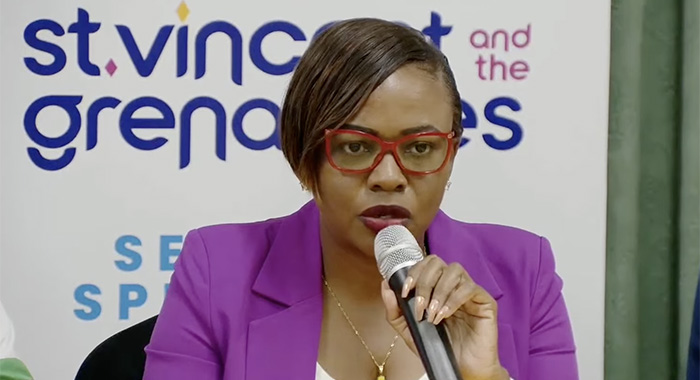
When asked about the creative decision behind using lowercase letters to spell the country’s name, Brand Manager Natasha Anderson responded with a question: “When you think of us… do you think we’re formal people? Do you think we’re stiff?”
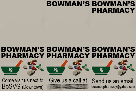
She answered in the negative, saying that Vincentians are easy-going and that the authority wanted the letters to reflect that trait.
“So, sometimes when you look at a word, it has a personality, it has a feeling, depends on the font that you use.”
Anderson maintained that the lowercase lettering represents who Vincentians are, reinforcing that they are approachable people who are deeply comfortable in their own identity.
“So it’s meant to, again, reinforce that we are an easygoing, approachable type of people,” she said. “This is who we are, and we are not putting on a front for anybody. Just easygoing, approachable, warm.”
iWitness News questioned the team that common geographical elements in the logo — such as mountains and the sea — could represent any other Caribbean destination, asking how the authority defends the distinctiveness of the symbolism.
CEO Shafia London responded by noting that SVG is the second most mountainous Windward Island.
“So, whilst there are many Caribbean islands with mountains, St. Vincent in particular is the most dramatic.”
London said that when most people arrive and look at the topography of St. Vincent, they think that it’s much larger because of that mountainous terrain.
“It is a blessing I tell you, so we can always say that something else could be replicated elsewhere, but it’s not just the physical surroundings, it’s also what the people do with it, right?”
London said that the public must remember that Vincentians tend to “live in the land” which makes them special.
“It’s not just the physical appearance, because as you mentioned…beaches can be found anywhere, mountains can be found anywhere.”
However, she said the amalgamation of these things makes it unique to Saint Vincent and what they do and enjoy.
London added that the design contains different symbolism, and the symbolism is an amalgamation of who Vincentians are as a nation.
“So first, we are an island. So if you’re an island, you must have water. But for us, the water is so much more important because we have the best waters, hands down, so we must represent water.”
She also said the country is known to have the best sailing waters in the world.
“And as a matter of fact, we have almost 40% of the market share in the sailing industry in the Eastern Caribbean.”
London explained that it would be a shame if the authority omitted that from its messaging.
“Yes, it didn’t have to be in the logo, but at the same time, if you already have so many visitors coming for your waters, then you’d want to wave that proudly and demonstrate that.”
She said that the mountains in the logo are not just mountains.
“What you’re seeing there is a dramatic design of La Soufriere, but also waterfalls. We have hundreds of waterfalls.”
London also that the tourism authority is embarking on a project to confirm that they have over 365 waterfalls, and that is why they included the waterfalls.
She added that this design is creatively strong, and highlighted that if one were to zoom in, they would see the archipelago of Saint Vincent and the Grenadines.
“There are several islands that you can see, and then that forms the middle; but then we anchor it with the diamonds, and the diamonds can be interpreted in many ways, some people see it as stilts, as the houses on the mountain side, some persons see it as just our diamonds and a replication of our flag in some way, but others actually see it as a picture frame, that there are three picture frames, and you decide what you want in the frame when you come to set your spirit free…”
London said the togetherness makes the logo special, and not the individual items.
“So you have to look at this together to understand the messaging that’s here. It’s truly deep.”
She shared that her favourite part of the logo is the candles.
“I told my team this. The candles, as simple as they are, is my favourite part because for me, Saint Vincent always on like a candle. Our spirits always lit. We always lit, right? And that’s what the candles represent for me.”
London said that when she saw the logo, she thought it was beautiful, reiterating that one must look at the logo as a whole.
“…You have to look at it together to truly appreciate it. But at the end of the day, we are an island. We have mountains. We have seas.”
London explained that while other islands have the same features, very few can boast of having all of that in one nation.
“…We could always play the compare game. You know what? I can go climb a mountain in another island and do whatever…are you aware of how many airports we have? Are you aware of how many seaports we have? What other island can say that? What other nation can say that? The accessibility is what is key here.” Public Relations Officer Alex Barnwell said, adding that there will be an upgraded seaport in Union Island soon.
“…These are some of the unique things that bring it together. So yes, we have a mountain. Yes, we have waterfalls. Yes, we have beaches. But who can claim the level of accessibility that we have?”
He explained that one can fly from Saint Vincent to Union Island and fly back the next day. “Not true? It’s unique. It’s different. Some places like, let’s just talk for the sake of talking, Florida Keys.” He described this as a logistical nightmare, long and arduous. “…It is not like the snap of the finger. You can literally wake up and go and experience one of the other islands.”
He added that the Florida Keys are nice and that they have connected highways, but sometimes there is not much there. “Big up anybody in the states, but you know we have something more unique because every single island has culture.”
Barnwell concluded by saying that the islands also have people, community, farmers and fisherfolk who have cultural events of their own, which adds to the uniqueness.